
Brand identity
The translation of your decision into a story, a tone and a visual language your team can carry itself.
- Part of
- Branding & Strategy
- Follows
- The positioning
- Covers
- Story, tone, visual language
- Test
- Can your team do it alone?

Pretty is easy. Recognisable is the point.
An identity that looks good but could sit on anything does nothing for you. The question is whether someone who sees three pieces of yours without a logo still knows it is you, and gets the right feeling from it.
That only works when there is a decision underneath. So this work starts with the positioning: without direction it becomes an argument about taste, and that is won by whoever talks loudest.
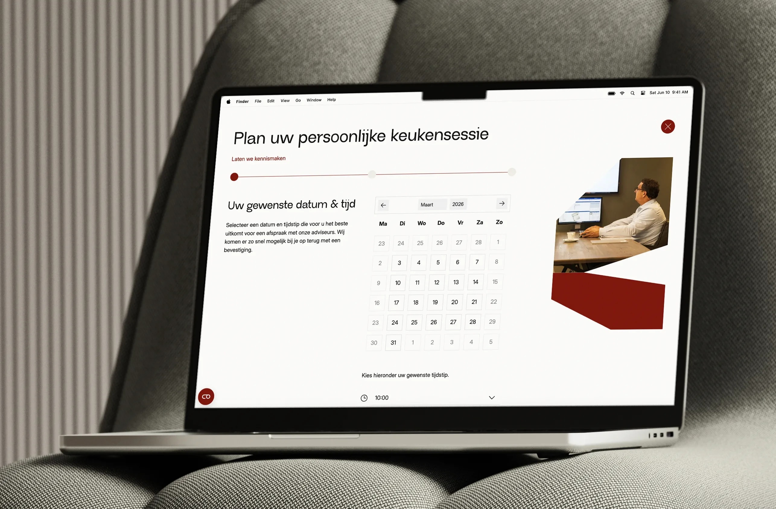

An AI-driven client portal that lets customers find answers themselves, day or night
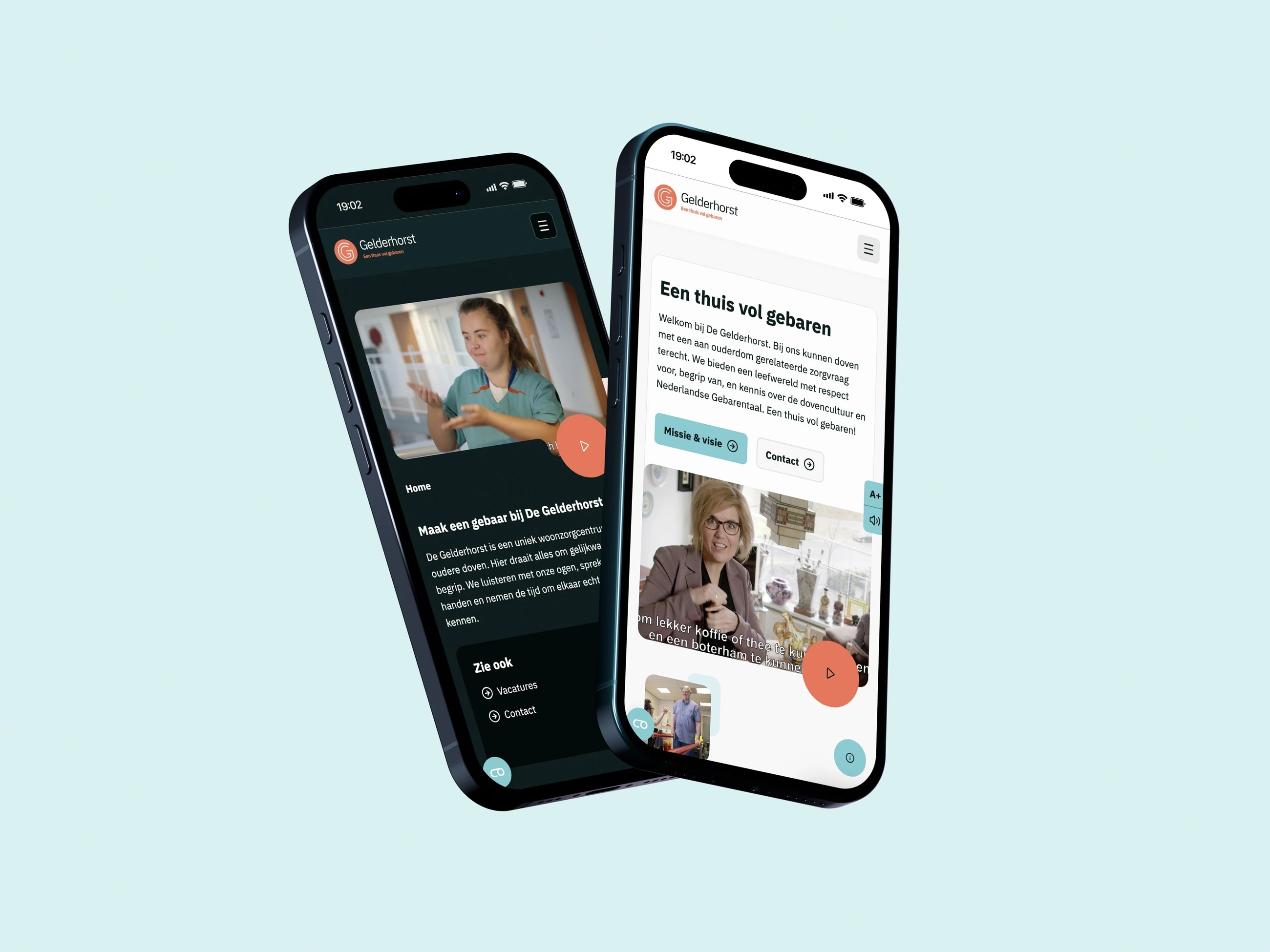

An accessible platform for older deaf people, with its own sign language translation module
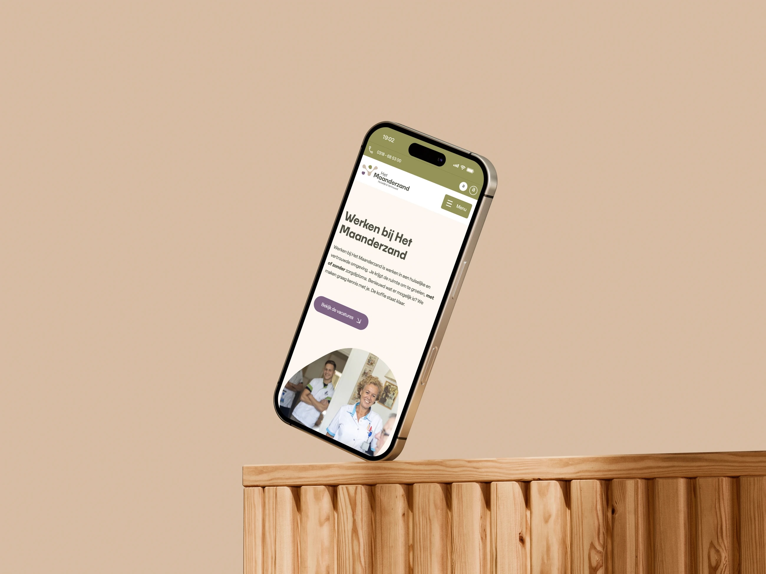

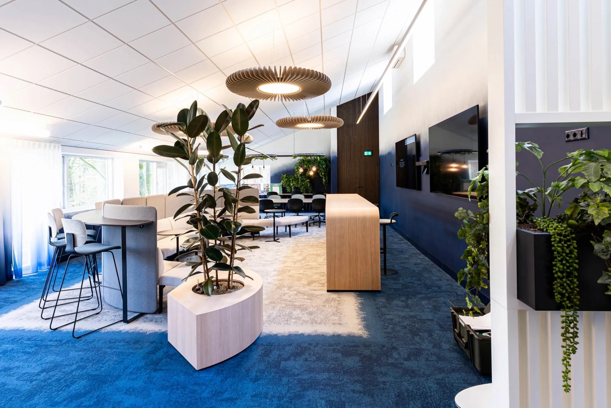
Rebranding back to the core, plus two platforms: one for residents, one for new colleagues

From supplier to adviser: new positioning, brand and platform
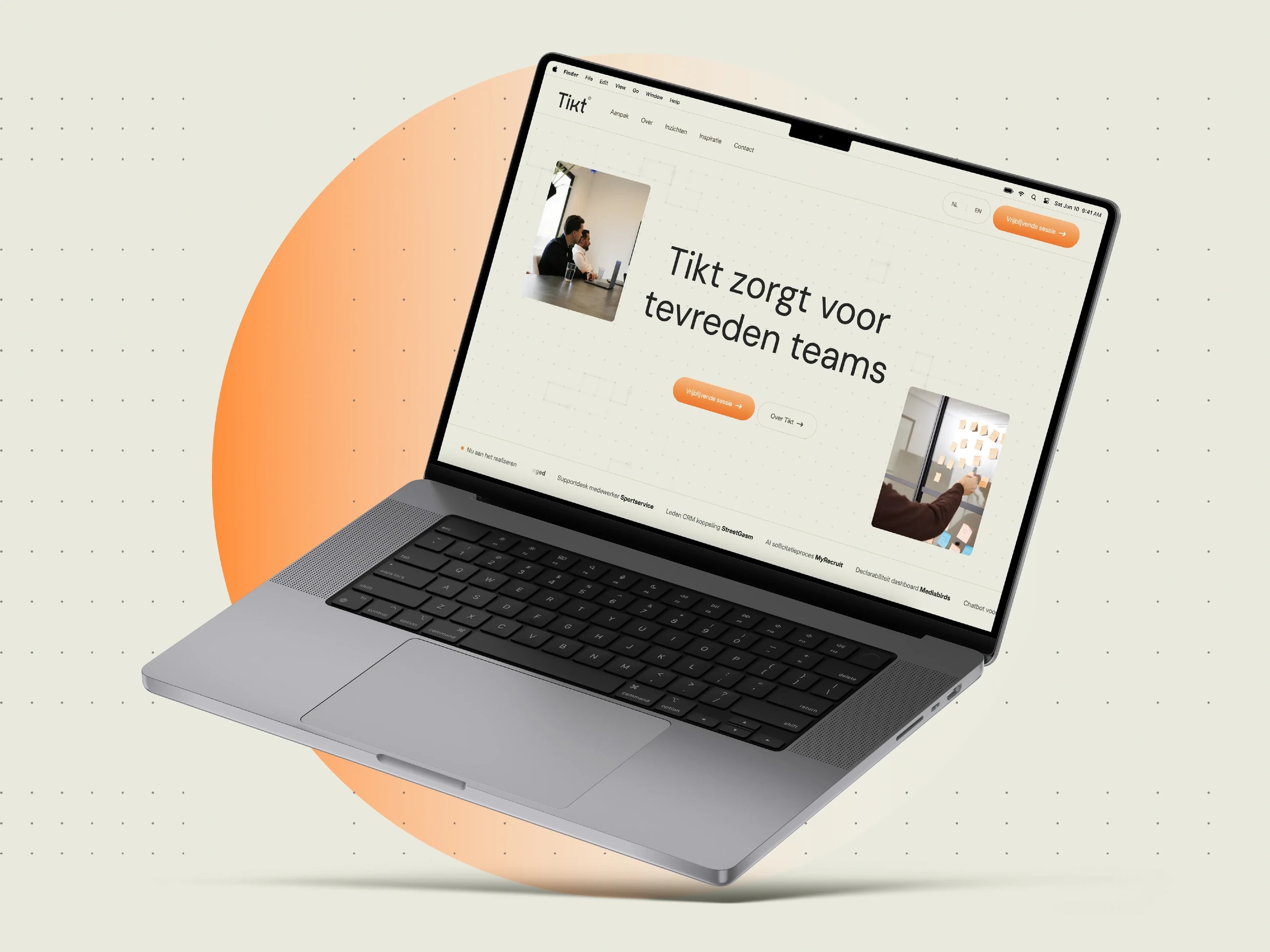

A new AI brand that became visible straight away in a crowded market, through SEO and GEO
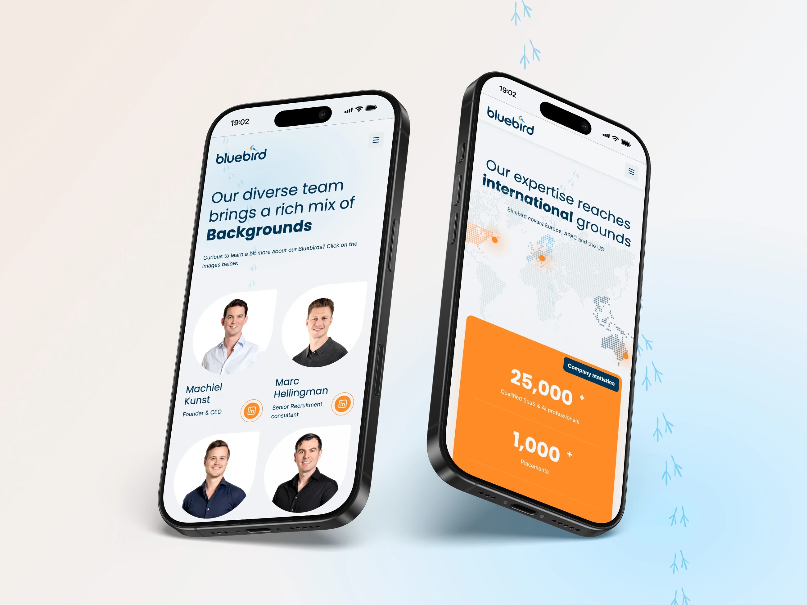

A brand and platform at the level of the specialist in SaaS and sales recruitment


From ambition to authority: proposition, brand and platform for the Benelux
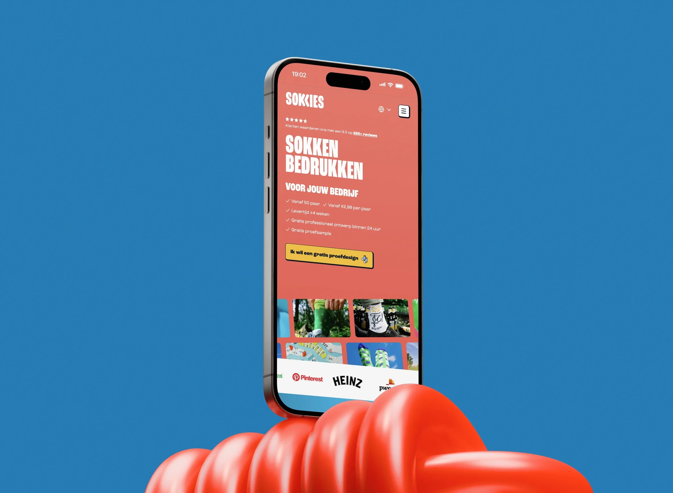

A custom online store that scales to four languages automatically
Where this was part of the work
01 / 10
A story, a tone and a visual language that belong together.
The story is what you tell and in what order. The tone is how that sounds: formal or direct, explanatory or definite. The visual language decides what you show and what you don't. That last part is often the most defining.
Those three should come out of the same decision. A bold story with cautious photos and a cautious tone is three pieces of half work.
Brands we worked on




















































The test is whether your team can do it themselves.
An identity that only works when the designer applies it is a style. So we deliver examples and rules a colleague can use to make a presentation, a job ad or a social post that belongs without being told to.
That is also the test during the project: have someone from your team make something with it before we are finished. If they can't, it isn't done.
Common questions
Not answered here? Ask the AI in the top right, or call us.
Brand identity is the whole: story, tone and visual language. Visual identity is the visible toolkit inside it: logo, typography, colour and the rules around them. In practice they run into each other; we usually do them in one project.
In principle yes, because without a decision it becomes an argument about taste. If a sharp position is already in place, whether from you or from another party, we build on it rather than redo it.
Yes. Tone matters at least as much as visuals, and it is often the piece that is missing. You get examples of how it does and doesn't sound, plus the rules underneath, so a colleague can work with it themselves.
By having someone from your own team make something with it during the project. If they can produce a presentation or a post that belongs without being told to, it is usable. If they can't, we keep going.
Usually, and the design gets sharper for it. The place where brand work waters down is the step to what goes live; with us that step sits at the same table.
Mediabirds in numbers
0
digital partnerships
0
years of experience
0
specialists on the team
0+
collaborations
We don't design anything we couldn't build ourselves.
That limits what we draw, and that is the point. The place where brand work usually waters down is the step to what goes live: a design that turns out not to be technically feasible gets stripped along the way, and nobody notices when.
Because design and build sit at the same table with us, what you see in the presentation is also what ends up there.
Would anyone recognise you without the logo?
That's the only test that counts.
Let us look at what you show now. In half an hour you'll hear whether there is an identity underneath it or only a style.